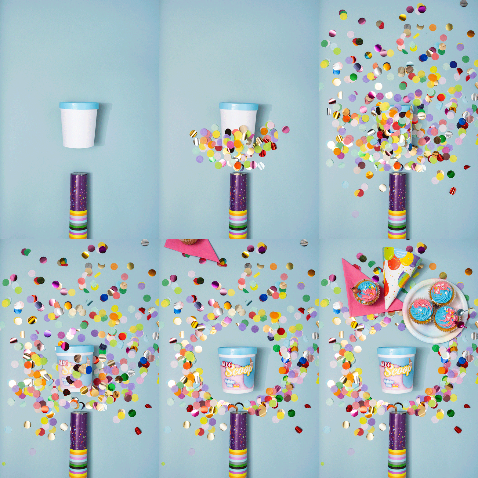
THE SCOOPThis fun project was all about bringing the delicious flavours of the ice cream to life through eye-catching design. I focused on creating a bold visual identity that would stand out on shelves, using playful illustrations inspired by each flavour.
To add an extra layer of engagement, I made stop motion videos that highlighted the bright colours, fresh ingredients, and overall vibe of the brand. These short clips served as fun, scroll-stopping content to showcase the product in action.
From concept to final design, I balanced creativity with clarity—making sure the labels were both visually appealing and easy to read, while fitting seamlessly within dieline and brand guidelines.
January 2024
Vancouver, BC
Photography — Alina Ilyasova, Tara Dejanovic
Packaging Design & Creative Direction — Tara Dejanovic
Select Works
Packaging Design
Product Photography
Personal Projects


